If you’re in the non-profit sector, then you know the role of online fundraising has shifted from being an optional avenue to an absolutely critical channel. But it’s not just about having a web presence; it’s about squeezing every ounce of potential out of that digital real estate. A well-designed website doesn’t just look good; it’s a treasure trove of valuable data and a hub for donor engagement.
Through sign-up forms, member registrations, and smart use of analytics, your website can serve as a window into your donors’ behaviors and preferences. The trouble is that most non-profits don’t have the technical expertise on staff to leverage many of the high end tools available to the industry. And if that sounds like you, then you’re about to hit a jackpot.
In this guide, we’ll cover some essential, easy-to-implement website integrations that can make a big difference in your online fundraising. We’ll also share some pro tips to help you cut down on those annoying processing fees. Ready to level up your online fundraising game? Let’s dive in!
Direct Payment Links: The Fast Lane to Fundraising
Let’s start with our personal favorite… Payment links! In an age where time is of the essence and convenience is king, direct payment links like those from Stripe, PayPal, and Venmo are game changers. What’s a direct payment link… it’s when you use a built in ‘payment page’ from a payment processor to capture donations (instead of making your website do heavy lifting with API integrations and Member platforms).
- Speed: Cut to the chase. A direct link speeds up the donation process, which means less time for potential donors to change their minds.
- Simplicity: It doesn’t get simpler than a click. No fussing around with account setups or cart checkouts; just straightforward transactions.
- Flexibility: You can pop these links just about anywhere—social media, email footers, text messages—you name it.
- Branding: Unlike a well-designed donation page, a direct payment link may not provide much room for branding or storytelling. On the flip, you can have a well designed donate page (or opt in point) and link to a direct payment page so your website doesn’t have to do so much heavy lifting.
- Processing Fees: While some fees are inevitable, direct payment options might come with a slightly higher processing fees but different processors have special rates for non-profits.
- Advanced integrations: Most payment processors have advanced integration features allowing them to be linked to various CMS and book keeping tools. This is important to keep in mind as you may want to select a processor now whose full services align best with where you see yourself down the road.

Example: Setting Up Stripe for Seamless Online Donations
One of the best platforms to facilitate your online fundraising is Stripe. It’s known for its ease of use and has advanced features that can be extremely beneficial for non-profits. Let’s walk you through the basics.
Why Choose Stripe?
- Subscription Services: Stripe’s recurring payments make it simple for donors to give on a monthly basis.
- Isolated Payment Pages: These offer a secure and customizable environment for transactions, making donors feel safe while giving.
Getting Started
- Create Your Stripe Account: Visit the Stripe website and follow the instructions to sign up.
- Configure Settings: Navigate to the dashboard and go through the initial setup. Make sure to specify that you are a non-profit to potentially qualify for reduced fees.
- Create a Product: This is where you’ll set up your donation options. You can create various ‘products’ to represent different donation amounts or tiers.
Implement Subscription Services
- Navigate to ‘Subscriptions’: In your Stripe dashboard, go to ‘Products’ and then ‘Subscriptions.’
- Create Plans: Here, you can set up different subscription plans for recurring donations.
- Get the API Keys: You’ll need these to integrate Stripe into your website.
Isolated Payment Pages
- Create a New Payment Page: Go to your Stripe dashboard and choose ‘Payment Pages’ from the side menu.
- Customize: Add your non-profit’s branding, specify the payment options, and add a thank-you message.
- Publish and Integrate: Once your payment page looks good, hit ‘Publish.’ You’ll receive a link that you can easily integrate into your website or share directly.
Additional Features
- Stripe Dashboard: Easily track all transactions and subscriptions.
- Customer Management: Store donor information securely for future campaigns.
What really sets Stripe apart is their phenomenal customer support. Whether you’re just getting started or you’re looking to implement more advanced features, Stripe’s support team is always a click or call away. If you ever find yourself stuck or confused, rest assured that they will guide you through every step of the process until you’ve got it down pat.
Reducing Processing Fees: Maximize Every Penny
Most payment processors offer a notable discount on their fees for registered non-profits. Getting ahead of the curve can save you dollars in the long run. The earlier you begin planning, the better your chances of negotiating lower processing fees or taking advantage of any seasonal promotions. Being a non-profit, there are documents to prove your status. Keep your tax exemption certificates, licenses, and any other relevant papers handy. Established non-profits already know about this one though in our experience, fledgling non-profits often aremissing out on this entity perk.

Where to Submit:
Each platform has its own requirements and submission portals. Here are a few guides for your reference:
- STRIPE: https://support.stripe.com/questions/fee-discount-for-nonprofit-organizations
- Facebook: https://www.facebook.com/help/1640008462980459
- Square: there is no nonprofit discount
- PayPal: https://www.paypal.com/us/non-profit/getting-started-fundraise
- Venmo: https://help.venmo.com/hc/en-us/articles/6678084998291-Charity-Profile-FAQ
- Amazon: https://affiliate-program.amazon.com/help/node/topic/GYV3PYEB9BWM2L6J
Partnering With Local Banks: An Overlooked Treasure
Local banks often offer a trove of benefits that larger institutions can’t match. From discounted processing fees to unbeatable customer service, here’s what to look for.
- Discounted Fees: Local banks often provide competitive rates on transaction fees, which can significantly impact your bottom line.
- Exclusive POS Systems: Get access to Point-of-Sale systems that are tailored to your needs.
- Online Payment Solutions: Many local banks offer integrated solutions designed for non-profits, making your online transactions smooth.
- Personalized Customer Service: Forget generic 800 numbers; enjoy direct lines to someone who actually knows your name.
- Additional Benefits: Some banks go above and beyond by offering free financial consultations, community partnerships, and more.
How to Approach Local Banks:
- Do your research and identify potential partners.
- Set up meetings and prepare a solid case for your non-profit.
- Negotiate the terms that best suit your needs.
Choose Online Vendors Wisely
Not all payment platforms are created equal. Weigh your options based on your needs and their offerings. For instance, Square doesn’t offer a nonprofit discount, but Stripe and PayPal do. Make an informed decision, keeping in mind all your requirements.
Website Pop-Ups
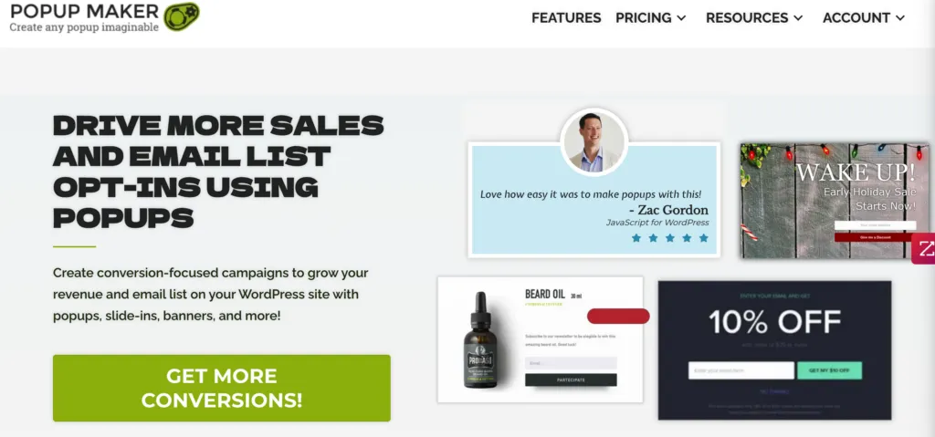
Website pop-ups, those handy little boxes that seem to know just when to say hello. But be cautious, while pop-ups geared toward donations or newsletter sign-ups can capture attention, they can also annoy if not done right.
Customize Pop-Ups for Different Pages or Entry Points
One size doesn’t fit all, especially in the pop-up game. You can actually tailor the wording of your pop-up’s Call-To-Action (CTA) based on the page or entry point a visitor comes through. For instance, if someone lands on a blog post about your recent fieldwork, the pop-up could say, “Inspired by our recent project? Donate now.” On the homepage, a more generic “Support Our Cause” might do the trick.
Frequency & Timing Settings
Your pop-up doesn’t have to be a one-time affair or a relentless nag. Most pop-up plugins for platforms like WordPress or Squarespace allow you to control how often they show up. You can set them to appear once a day per user, or every time someone lands on a specific page.
You can also get sophisticated with timing based on user behavior. Want the pop-up to appear after the visitor scrolls halfway down the page? Or how about when they’ve been on a page for at least 2 minutes? All doable!
Implementation Guide
Looking to get started? Here are some pop-up plugins you might want to consider:
• WP Pop-up Maker from Code Atlantic
Don’t Sleep on Chatbots: Here’s Why and How
When you hear the word “chatbot,” your mind might wander off to some high-tech AI wizardry, but the reality is a lot more down-to-earth. Chatbots have democratized in recent years, becoming more accessible and easier to use than ever before. And you should be paying attention to them for your non-profit. Here’s why:
Convenience is Key
Chatbots are the unsung heroes of the customer service world, available 24/7 and able to handle multiple queries at once. Imagine someone landing on your donation page at 3 a.m. Who’s going to answer their questions? Your chatbot, that’s who.
Real-Time Engagement
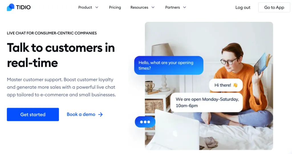
Most platforms come with a very basic chatbot that can link directly to your cellphone, offering real-time engagement without the fluff. You don’t need to get super technical; just set up a few automated responses and you’re good to go.
Getting Fancy with Tidio
If you’re willing to up the ante, Tidio is a game-changer. Its user-friendly interface allows you to create custom automation sequences and AI responses without needing a degree in computer science. This means your chatbot can get a bit smarter, helping guide visitors through donation options, explaining your mission, or even suggesting events they might be interested in.
A Quick How-To
Setting up a basic chatbot is easier than you think. Platforms like Tidio often offer free plans and easy integrations with popular CMS systems like WordPress. Want to guide visitors to your donation page? Set up an automated sequence that kicks in when someone asks, “How can I donate?” With a little initial setup, your chatbot becomes an extra member of your team, one that doesn’t take weekends off.
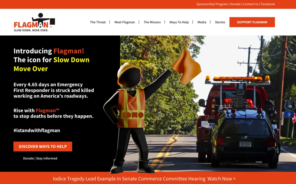
The Art of Strategic Donation Buttons: It’s Not Just a Button, It’s an Invitation
Look, I get it. A button is just a button, right? Wrong. In the context of non-profit fundraising, a donation button is more than just a clickable object—it’s essentially an invitation to make a positive impact. When designed and positioned thoughtfully, these buttons can serve as powerful calls to action. Here’s how to make the most of them:
Why It Matters
Donation buttons are like signposts that guide your visitors. Done wrong, they’re easily overlooked. Done right, they can catch the eye and tug at the heartstrings. The right button, with the right message, can convert a casual visitor into a committed donor.
Location, Location, Location
The rule of thumb for button placement? Be omnipresent but not obnoxious. Key locations include the header and footer, any “About Us” or mission-related pages, and of course, on your dedicated donation page. But consider also placing them in blog posts that have high traffic or are particularly emotional or persuasive. Also consider reintroducing your most popular blog posts to your list/audience every now with a message about how their support makes your mission possible + a button!
Timing is Everything
The latest UX research shows that presenting a call-to-action at the right time increases conversions. You don’t want to bombard new visitors the second they arrive; let them explore a bit. Some CMS platforms allow you to time your donation button to appear after the visitor has scrolled down a certain percentage of the page or spent a specific amount of time on your site.
Not Just One, But Many
Why stick to one style or message? Experiment with button text. While one visitor may resonate with a straightforward “Donate Now,” another might be moved by a more emotive “Help Change Lives.” You can use analytics to A/B test different button styles and texts to see what’s most effective.
The Underlying Technology
Don’t overlook the backend. The donation process should be as seamless as possible. Use well-known payment processors like Stripe, PayPal, or Venmo to instill trust and ensure a smooth transaction experience for the donor.
Email Campaigns Maximize Website Upgrades
Emails are like the bread and butter of online marketing and fundraising. Think about it: your inbox is one of the few online spaces where you have undivided attention. It’s just you and the email—no flashy banners or distracting sidebars.
Why Email Campaigns Are Essential for Donor Engagement
Firstly, the stats back it up. According to Campaign Monitor, non-profits have an email open rate of around 25.17%, well above the average. That’s not a figure to scoff at, folks. These emails help you build a relationship with your donors; they’re more than just transactional messages. The key is to get the balance right between “We need donations” and “Here’s the amazing stuff we’ve done thanks to your support.”
Entry-Level Tactics: Built-In User Notifications
While sophisticated platforms like ActiveCampaign cater to a range of users—from novices to the pros—let’s not overlook the power of the most basic form of email: user notifications. Almost every form setup you encounter, be it for newsletters, event signups, or feedback, will have an option for a thank-you email or confirmation notice.
Why is this important?
Because it’s an immediate touchpoint with someone who’s already engaged with your non-profit. Use this opportunity to gently introduce your fundraising message. For example, a simple “Thanks for subscribing to our blog! If you’d like to support our mission, click this link to donate” can work wonders. It doesn’t replace a well-planned email campaign, but it’s a stepping stone, a low-effort, low-cost way to get your feet wet in the world of online fundraising.
This approach ensures you’re not leaving any stone unturned when it comes to avenues for fundraising. You may not have the fanciest tools, but you’ve got grit and creativity—and sometimes, that’s all you really need.
Other Types of Email Campaigns
- Welcome Series: When someone first subscribes to your newsletter or makes a donation, roll out the red carpet for them with a welcome email series. This is your chance to showcase what you do and why you do it.
- Fundraising Appeals: These are your heavy hitters. Crafted with compelling stories and a clear CTA, they aim to convert those emotionally resonant moments into donations.
- Update Emails: Don’t just go silent after you get a donation. Send regular updates on where the funds are going, the progress being made, and how their contribution is making a difference.
The Anatomy of an Effective Email
A great email starts with a catchy subject line and includes personalized greetings (automation can help here), compelling narratives, beautiful visuals, and, importantly, a clear CTA. You want to guide your reader through the journey—from empathizing with the issue to taking action.
Tools to Kickstart Your Campaign
If you’re not a tech wizard, don’t sweat it. There are plenty of platforms with user-friendly interfaces and templates that can help you kickstart your campaigns. Platforms like Mailchimp, Constant Contact, and ActiveCampaign have various pricing plans, sometimes even free ones with features that are pretty robust.
QR Codes: The Bridge Between Offline and Online Giving
Ah, the humble QR code—a series of pixels that’s a powerhouse for digital transformation. When it comes to non-profit fundraising, QR codes are the unsung heroes bridging the gap between offline events and online giving. Let’s delve into why they’re invaluable and how to make them work for you.
Why They’re More Than Just Squiggly Squares
QR codes are incredibly versatile. They can be placed in printed flyers, on event banners, or even on merchandise, and they work to direct potential donors to your online donation page instantly. Essentially, QR codes break down barriers, making it quicker and easier to go from intention to action.
Seeing Is Believing: Real-World Examples
Picture this: You’re at a community event, and you see a compelling poster about a cause you care about. Next to the gripping statistics and heartwarming photos is a QR code with a simple message: “Scan to Make a Difference.” In this case, the QR code has the power to turn an emotional response into an immediate action, without the hassle of remembering a website or finding a donation box.
Creating and Linking: Make It Snappy
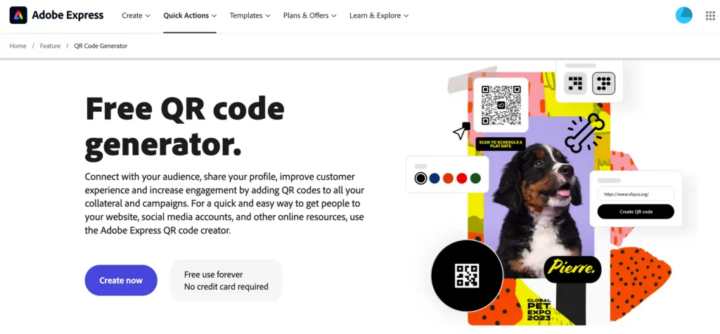
So, you’re sold on the idea but not sure where to start? There are numerous tools that can help you generate a QR code. Here are some platforms that are easy to navigate:
Once generated, all you have to do is link the code to your donation page. Simple, right?
Customization: One Size Doesn’t Fit All
What’s cool about modern QR codes is that you can track them. This way, you can see which ones are performing well and where most of your scans are coming from. By using dynamic QR codes, you can even change the destination URL without having to reprint the code, making it a cost-effective and flexible tool.
Up Your Game: Multi-Currency, ADA Plugins, Retargeting Campaigns, oh my.
Why It’s Crucial:
In the connected world we live in, accessibility, global reach, and data-driven decisions are no longer buzzwords; they’re necessities. Multi-currency options widen your donor pool, ADA plugins ensure your site is accessible to all, and retargeting campaigns keep your mission front and center in people’s minds.
Implementation Overview:
Honestly, you’ll likely want a marketing expert to handle this if you’re going for maximum impact. However, for a high-level understanding:
- Multi-Currency: Plugins or custom coding will enable this. Shopify and WooCommerce, for instance, have this capability.
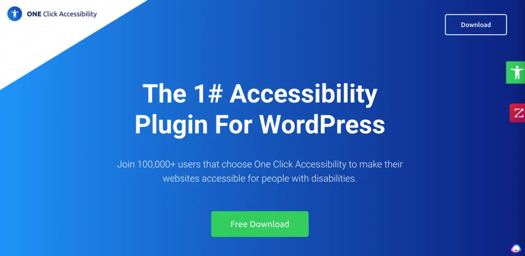
- ADA Plugins: One Click Accessibility is a popular WordPress plugin that can help make your site ADA-friendly.
- Retargeting Campaigns: You can use platforms like Google Ads or Facebook Ads to set these up. These campaigns require ongoing monitoring and potentially A/B testing for effectiveness.
Wrapping Up: Your Roadmap for Enhanced Non-Profit Fundraising
We’ve covered a lot today, from easy-to-implement strategies like strategic donation buttons and QR codes to slightly more advanced approaches like multi-currency support and retargeting campaigns. Each of these elements plays a critical role in optimizing your non-profit’s online fundraising potential.
Remember, the tools are just the beginning. The real magic happens when you combine these strategies with compelling storytelling, focused analytics, and a deep understanding of your audience’s needs and behaviors.
So, what’s your next step? We encourage you to evaluate your current online fundraising strategies and see where these integrations and tactics could fit in. Every small change could mean additional funds for your cause, better engagement with your community, and a more effective, more rewarding fundraising strategy.

