Make Your Website an Inviting Front Door To Your Business For More Conversions
Do you know that around 38% of website visitors leave a site if they find the content or the layout unattractive? Similarly, 72% of people prefer mobile-friendly sites. What if your website is slow? 47% of internet users expect a web page to load in less than 2 seconds.
Unfortunately, too many business owners believe that having an engaging website means just a pretty design. They ignore user experience and lose a substantial amount of revenue.
A great user experience is crucial for the success of your business. This article will discuss easy tips to improve user experience and boost conversions (aka revenue).
What is User Experience?
Website user experience refers to a set of behaviors displayed by your website visitors. It references how convenient and pleasant users find it to interact with your website. When you try to improve a website’s user experience, you make it a better place for your customers.
A website with a great user experience is:
- Easy to use
- Accessible to everyone
- Adds value
- Easy to navigate
- Satisfies user’s requirements
- Credible
- Desirable
Why is User Experience is Important?
Your website is likely the center of your digital marketing efforts or perhaps even all of them. It is a prospect’s 24/7 salesguide and has the potential to make or break a business.
These statistics illustrate how important a prospect’s online experience is for the growth of your business:
- 44% of the target audience leaves a site if there’s no (poor) contact information on the website.
- 39% of site visitors leave if site images take a long time to load.
- 57% of internet users say that they won’t recommend a business that doesn’t display well on the mobile phone.
- 40% of smartphone users search for products on their phones before purchasing them.
How To Create a Great Website User Experience?
Follow these tips to improve the user experience of your website.
1. Speed Optimization
So, you’ve landed on a website and it’s taking more than a sip of coffee to load. If you are like us and the 90% of other average website users, chances are that you are going to leave that website immediately.
According to research by Google, the bounce rate can increase by 32% as page load time goes from 1 second to 3 seconds. It is for this reason that website optimization is very important. Improving site speed can greatly improve conversions.
According to a Ubounce survey, 70% of consumers admitted that page speed impacts their decision to buy from an online retailer. Similarly, in one of their studies, Search Engine Journal also reports that Page Speed is a Google ranking factor.
Find out the page loading speed of any page of your website through one of the following tools:
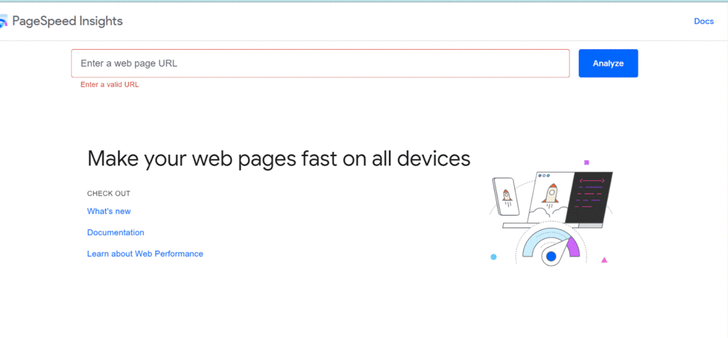
PageSpeed Insights (PSI) is an online free tool developed by Google that provides a report on page performance. It also gives valuable suggestions to improve your site speed.
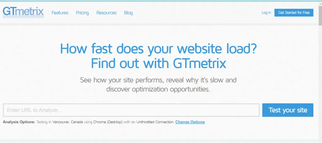
Another tool that performs the same function is called GT Metrix. The tool provides an in-depth report on your website’s performance.
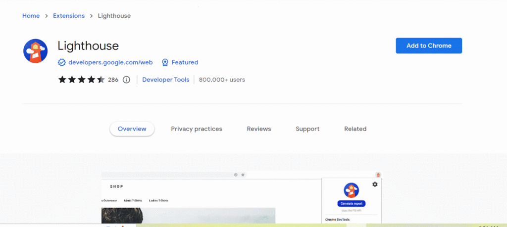
- Chrome Lighthouse
Developed by Google, it is an automated tool for improving your site’s performance, speed and an overall experience. The tool runs various tests against a page to generate a report on the performance and quality of a web page. You can download the extension from the Chrome web store and use it for auditing your web pages.
Once you have found out the pages with the slow loading speed, it’s time to fix them. One way to improve page speed is by compressing all your images before loading them on your website. TinyJPG is a helpful tool that can reduce the size of your images before they’re added to your website.
2. Address 404s
A 404 error message is also called “header response code” or “HTTP status code.” If a website page has errors, bugs, and glitches or a user has input a wrong URL, he may see a 404 error message. 404 error message tells the search engines and humans that the requested URL doesn’t exist or can not be found.
Encountering 404s can completely disrupt a user’s experience on your website. You can check for 404s by setting up Google Webmaster Tools on your site. Besides Google Webmaster Tools, you can also use a free web application to check for 404 errors.
3. Make Your Website Responsive and Mobile Friendly
More than half of the web traffic comes from mobile devices like smartphones or tablets. If your site is not optimized for mobile phones, you are losing most of your traffic. This likely means your potential customers will leave your site and go to your competitor’s site. So how can you check if your website is user-friendly for the traffic coming from mobile devices? You can use MobiReady’s mobile-friendly test tool.

The tool will point out current issues and actionable items to make your website mobile-friendly. You can also load your website from different devices to check how they look on different devices.
4. Effective And User-Friendly Navigation Bar
If your navigation bar is more confusing than a Rubik’s cube, website visitors are going to move on fast.
The navigation bar is one of the most important parts of your website. It’s the gateway and map to your site and business. It should make it easy for users to get from one page to another. If you add too many options or dropdowns it can confuse, and that’s not what we want.
To keep things straightforward and friendly, try these simple tips:
- Keep it short. Users don’t want to scroll miles through a convoluted navigation bar or sift through pages and pages of text just to find out where they’re going next. They’ll get bored (Annoyed? Discouraged? Stressed?) and leave before they get where you need them to be! So keep your options limited and clearly labeled.
- Keep it simple. You don’t want people getting confused by the ‘map’ while trying to find what they need on your site, and lots of choices, long words, and similar phrasing can make them feel overwhelmed and frustrated instead of empowered by the potential for choice. So, keep things simple by using clear and concise labels.
The website of NSDS has a very clear and concise navigation bar that enables people to quickly find out the information they want. It results in a positive user experience (including on mobile).

Gone are those days when it was believed that design alone can improve user experience. Instead, today’s content curators are in the spotlight equally. While a web designer is tasked with usability and interaction design, a content curator is tasked with creating search engine optimized content to boost conversions. Good content provides the necessary information in a structured and organized way for the reader to easily understand.
5. Helpful Content
A writer should pay attention to the following:
- The content should be readable and understandable.
- The layout of the webpage should improve readability and user comprehension, not overwhelm the design, functions or CTAs
- The content should be focused on users and what they need to know to decide if they’re a good fit for your services (self vetting)
- Develop content with clear wording, a prominent call-to-action, and a value proposition.
- Focus on search engine optimization. The content should not only be pleasing for users but also result in higher search engine rankings.
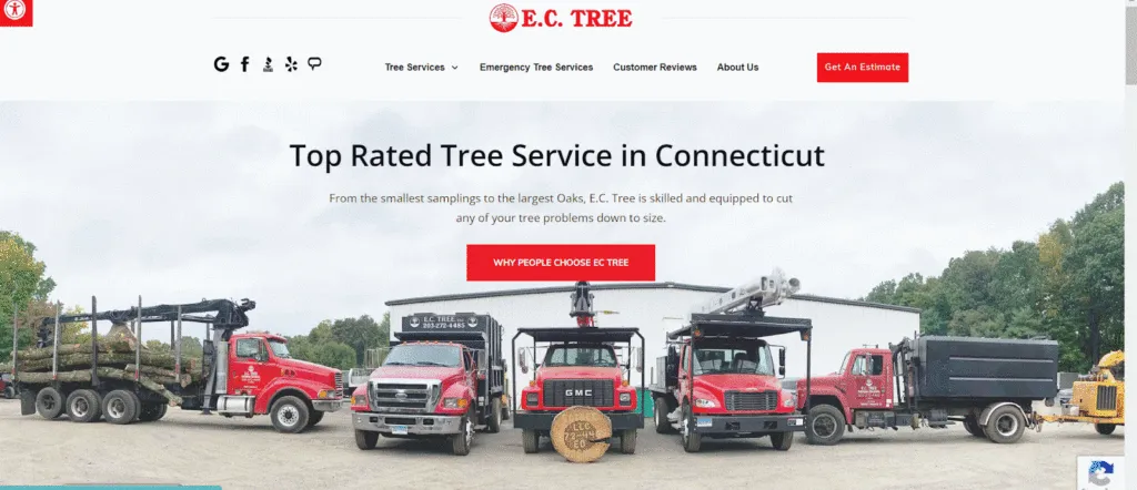
Have a look at the website of EC Tree service. NSDS designed the website, developed optimized content, and wrote clear CTAs for improved conversion.
Above all, content should either help a user decide if you (and they) are the best fit for your services or it should help users get to wear they need to be to benefit from your services.
6. White Space
One of the overlooked and historically underutilized design elements that can improve a user experience is white space on a web page. White space is also called negative space and is leveraged in the areas between columns, graphics, text, images, or a variety of other elements.
This space makes the page more readable and easily scannable. It provides visual breaks that the mind subconsciously recognizes and translates into pauses between thoughts or subjects. White space prevents your web page from looking cluttered and helps users find needed information easily.
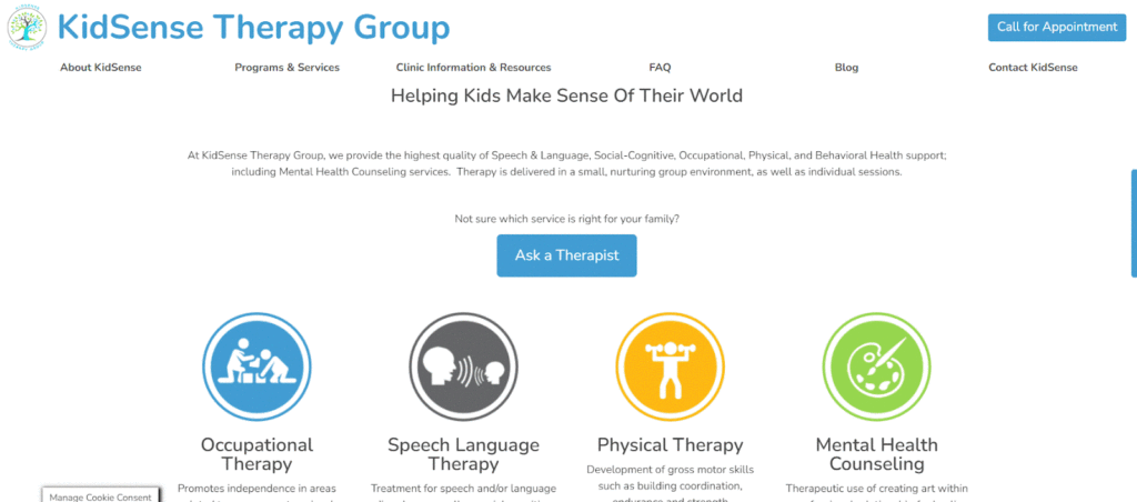
Have a look at the web page of KidSense Therapy Group, one of our clients based in CT. Their homepage leverages white space to focus user attention where it needs to be.
7. Consistency
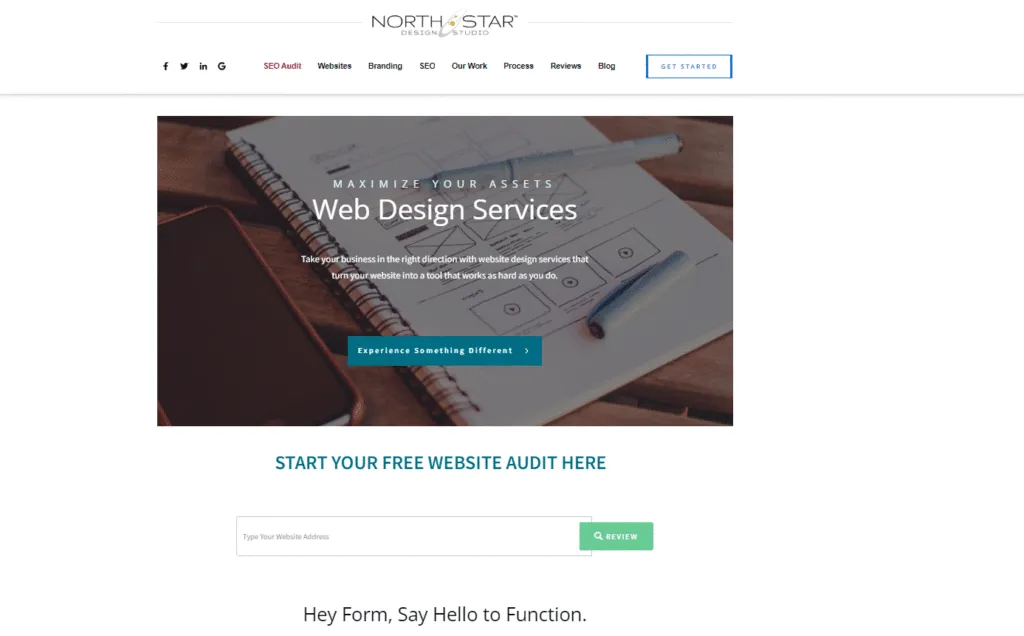
Consistency means that you should try to match all the website design elements such as heading sizes, font choices, coloring, button styles, spacing, or design. Everything on your web page should be coherent. The business website of North Star Design Studio is an example. All of our web pages have very similar designs, font styles, and images.
Drastic changes in design or content from one page to another can make your users feel lost and uninterested. It can increase your bounce rate or result in a lack of credibility and trust.
8. Multiple Ways To Contact You
Your consumers might have different preferences for contacting you. Depending on their age, location, or job, they might like to connect with you through social media, email, phone calls, or live chat.
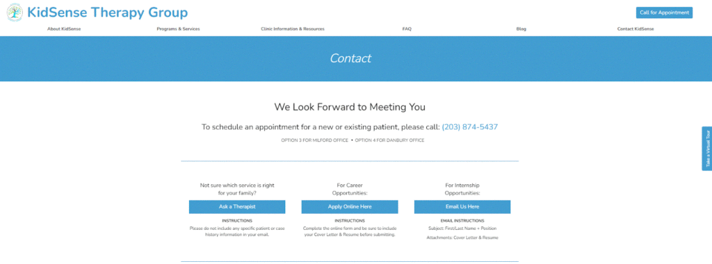
For example, most of the clients of KidSense Therapy Group like to contact them through a phone call. That’s why a “Call for Appointment” button is pasted right at the top of every page on your website. The contact page offers three other channels of communication for different purposes.
To improve conversions, ensure that you have added at least two or three channels of communication preferred by your customers.
9. Tweak Your Calls To Action (CTA)
Calls to action are typically the buttons that you put on your website meant to encourage users to take a specific action (ie: Start an Estimate, Book a Consultation, Schedule an Appointment, ect.).
Keep the following points in mind while designing a Call To Action:
- The buttons should stand out from the rest of the page but be in line visually with the overall theme and style of the web page.
- Don’t use too many CTAs as they can confuse the visitor and spoil their user experience. If a page has many CTAs, your visitor may not click them at all (choice overload)
- Simplify your CTAs for each page by focusing on two purposes
- Your primary CTA should encourage the most desired action a visitor should take, e.g. get an estimate.
- The secondary CTA should provide an alternative course to action, e.g. join our email list.
10. Make Your Hyperlinks Stand Out
When your users click on a hyperlink, they are directed to another page. However, these links need to be very explicit. Sometimes, visual cues like an underlined text or a different colored text can be used to draw the attention of the reader.
It is also important to use concise, explicit and self-explanatory phrases to let people know where they would land once they click a hyperlink. Using vague phrases like “click here” or “click this” hurt your search engine Accessibility scores and might create suspicion in the mind of the user.
Conclusion
I hope these tips have given you some great ideas to start improving your website. To see more examples of websites with great user experience, check out “Our Work.”
Want to know how your website is performing? Start with our free audit. Type in the URL of your website and get an in-depth performance report.
FAQS
- What is the difference between user experience and user interface design?
The term User Experience Design is often confused with User Interface Design or Usability. User Interface Design is a part of UX. UX designers are concerned with managing the user journey as they interact with a service or a product. On the other hand, a UI designer focuses on the construction of that product’s interface. Both aim at ensuring the highest levels of customer satisfaction by creating a user-centered design.
- What are breadcrumbs and how do they affect the user experience?
Breadcrumbs make it easy for website visitors to return to a specific page easily. The term refers to secondary navigation, where users can see where on the site they’re currently located. This is good practice for websites that have dropdown menus on their navigation bar.
The breadcrumb trail is a set of links that show where you are within the site’s hierarchy. They’re typically placed just above the site’s main menu, and they’re very useful if you’re trying to figure out how to get back home. If your e-commerce store doesn’t have breadcrumbs, your users may find it difficult to search for different products as they can’t go one step back in the hierarchy to a previous search results page.
- What is user research and why is it important to improve user experience?
User research is a systematic study of target users to understand their needs and pain points. UX professionals want to gather insights about user behaviors to improve web design. They like to understand how people visit a website and what they do on it. One way of doing it is to do A/B testing i.e. test variations of the same page to understand which variation works better. Another way to understand user interaction is by getting input from your customer service team. When your customers can’t find something on your website, they turn to the customer service team so they are aware of the frequent complaints or the questions your users might have.
Updated: 01-23-2024

